Proper construction is essential to the durability and longevity of picture framing. But framing is made to be looked at, and decisions about color and design determine the success of the visual presentation. Every framed item begins with design. Designing attractive framing does not require great expertise, but it is very helpful to have a general understanding of basic concepts of color and design.
Basic Color Theory
Although personal preference has a lot to do with which colors we think ‘go together’ and which colors we think clash. There is also a science of color that helps us understand the natural connections inherent in the color spectrum.
People have always enjoyed the colors of the rainbow and observed that they always appeared in the same order and blended where they met. In 1666, Isaac Newton used a glass prism to prove that white light is composed of all visible colors, and to advance scientific knowledge of the color spectrum seen in the rainbow. Later the color wheel was developed, as artists gained understanding of the relationship between colors and how colors of paint or dye could be combined to create all colors.

Notice that black and white are not on the color wheel. Black and white are used to create variations, called shades (adding black) and tints (adding white). Adding both black and white creates a tone. A monochromatic color scheme uses tints, tones, and shades from one hue.
Color and Design Trends
Popular trends in picture framing are linked to trends in art, furniture, and home décor accessories. The origin of design trends is somewhat mysterious. Once in a while a full-blown trend emerges from a popular movie, event, or celebrity. More often, the recipe is subtle, composed of numerous ingredients simmering over a period of time. Fashion is one important source, with the youth fashion observed on city streets worldwide providing some of the earliest clues. Graphic arts, seen in print and television ads, and on paper goods such as greeting cards and wrapping paper, are another experimental testing ground.
Designing Picture Framing
Perhaps the piece you want to frame is a family photo that will join many others on a wall. Or perhaps you are framing an art print that will be the focal point of a dining room wall. Maybe you would like to frame your son’s diploma, a vacation postcard, or a watercolor you bought at a local art fair. No matter what type of artwork is being framed, the first step is designing the framing, which includes decisions about color, style, size, and proportion. Custom Framing Wholesale provides you numerous designs and appropriate color options, suitable for your framing piece.
Making Choices
When designing the framing for a particular piece of art, there is not just one correct choice. In fact, in most cases, there are various attractive ways to frame the artwork. So how do you choose what to use? There are three basic foundations for designing framing:
1. Framing for the Art
This is considered the ideal in picture framing. Select the colors and style of framing based solely on the colors, style, and character of the art. This does not mean you should not use a modern metal frame on an antique print, or an ornate gold frame on a vacation postcard. There is a lot of flexibility and compromise in this ideal. The key principle is to focus on the art. The framing should complement the artwork, creating a harmonious presentation that does not distract the viewer from focusing on the art.
2. Framing for the Room
Framed art can be an essential component of a décor theme, tying various colors and design elements together; artwork is often chosen for that specific purpose. Art and framing intended to integrate with room décor need not be a perfect match with the paint and furniture but should coordinate with it using the same general color palette and style. If the colors and the style of framing do not suit the art at all, it will look out of place, and the visual relationship between the art and its framing will be awkward.
3. Framing for Personal Preference
Your home, your art, your framing, your way. Home décor is an expression of the owner’s unique style. A hot pink mat on black and white photos? Absolutely! Ornate Italian frames on vacation postcards from Florida? Why not? Framing that is intentionally offbeat or flashy can be lots of fun, especially in eclectic décor. The goal is to make purposeful design decisions, as opposed to random, uninformed choices. If the completed framing pleases the owner of the framed art, then it is the right choice—no matter how unconventional.
Choosing Colors
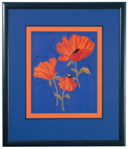
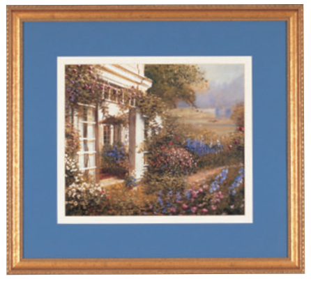
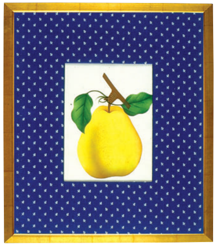
Some people think all mats should be white or cream. Others think matting should be more colorful. If color will be important in the framing, using the colors in proportion to how they appear in the art is the general rule. If the picture is mostly blue with a little white and a little pink, a blue mat with a narrow white frame might be best. But a pink mat may be the designer’s preference if the art will hang over a pink chair. The first step is to see the colors available in the artwork; in most art, there are many possibilities. If you are facing difficulty in color selection, contact our experts to help you choose the right color that will give a new look to your artwork.
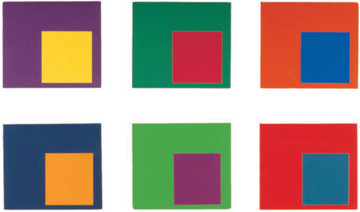
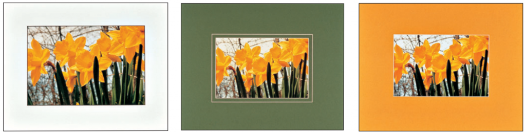
What a Difference a Color Makes
In most cases there are numerous color options for frame design, based on the colors in the art. The colors selected from the options to surround the art will affect how the art is perceived. Look at the three examples shown below. All three are appropriate, because all three colors are strongly represented in the photograph—but which looks best?
White Mats on Everything?
Over the past few decades, there has been a steady increase in the popularity of white and off-white mats in picture framing, regardless of the colors in the art. Proponents say this creates a neutral environment for any piece of art, which allows the art to stand on its own without distraction. It can help coordinate a collection of framed art that includes a variety of colors and styles. It can make any kind of art look important. The popularity of this style in museums adds to its sophisticated reputation. Of course, as with any design style, opinions differ. Instead of a clean focus on the art, some viewers see a harsh, bright eye-catcher that really does not “go with everything,” or they think it is boring! Personal preference based on observation of framed art will determine which opinion seems true. For details on mats, consult our blog “Matting in Picture Framing – Various Styles and Purposes of Mats”.
Using Official Colors
School colors, team colors, academic colors—many organizations and institutions have adopted official colors that become strongly identified with them. Matting is one good way to use official colors in framing, because matting is available in so many colors. Come as close as possible to the correct colors, but don’t worry about an exact match—the desired impression will still be created.
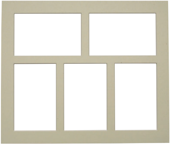
Designs with Multiple Images
Sometimes numerous photographs or objects are displayed together in one frame. With multiple objects, the goal is to avoid crowding (too little space between items), but make sure the objects relate to one another in the design—too much empty space between items creates a disconnected look. The right spacing is not a matter of mathematical precision; in a frame containing numerous items it often looks better if the spacing is varied rather than identical. Finding the right balance is a matter of trial and error: Try different arrangements of multiple objects until a suitable arrangement is found. Once the arrangement has been determined, add a mat border larger than the space between items to bring focus to the images. An example is to use 1″ (2.5 cm) between the images and a 2″ (5 cm) border surrounding all the images.